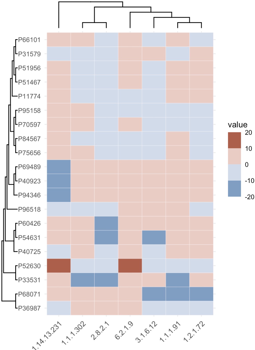
8.7 热图 EMP_heatmap_plot
热图用于可视化数据矩阵,通过颜色来表示数值的大小,被广泛应用于生物信息学、数据分析和统计学等领域,能够直观地展示数据集的模式和关系。
8.3.1 数据丰度热图
注意:
①绘制热图前,可以使用
②参数
①绘制热图前,可以使用
EMP_decostand进行标准化,从而使热图达到最佳的美化效果。②参数
palette可以修改色板。
🏷️示例:
MAE |>
  EMP_assay_extract('geno_ec') |>
  EMP_diff_analysis(method='DESeq2',.formula = ~Group) |>
  EMP_filter(feature_condition = pvalue<0.05 & abs(fold_change) >3.5) |>
  EMP_decostand(method = 'clr') |>
  EMP_heatmap_plot(clust_row=TRUE,clust_col=TRUE,rotate=TRUE)
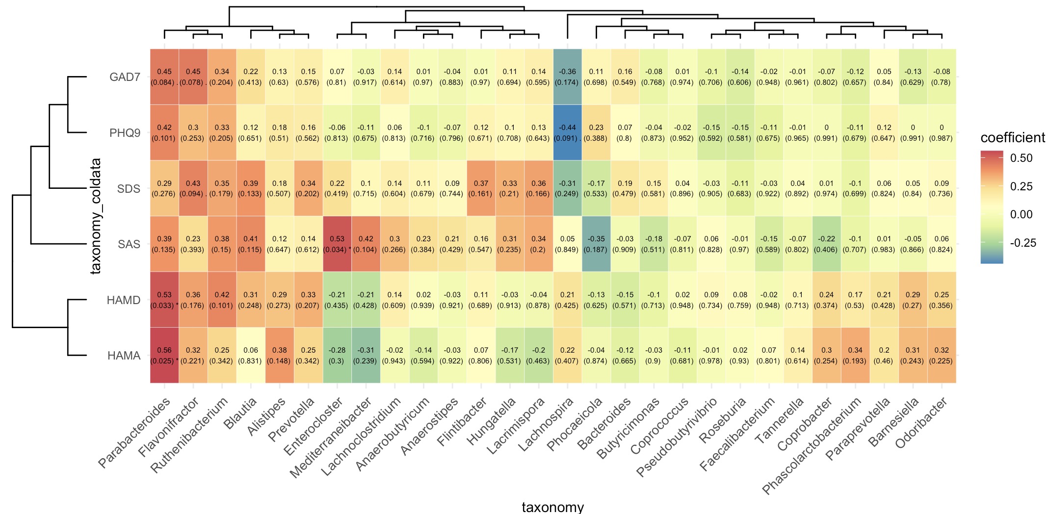
8.3.2 相关性热图
🏷️示例:
micro_data <- MAE |>
  EMP_assay_extract('taxonomy') |>
  EMP_identify_assay(method='default') |>
  EMP_collapse(estimate_group = 'Genus',collapse_by = 'row') |>
  EMP_decostand(method='relative')

meta_data <- MAE |>
  EMP_assay_extract('taxonomy') |>
  EMP_coldata_extract(action = 'add',
                      coldata_to_assay = c('SAS','SDS','HAMA','HAMD','PHQ9','GAD7'))
(micro_data + meta_data) |>
  EMP_cor_analysis() |>
  EMP_heatmap_plot(label_size=2,palette='Spectral',
                   clust_row=TRUE,clust_col=TRUE)
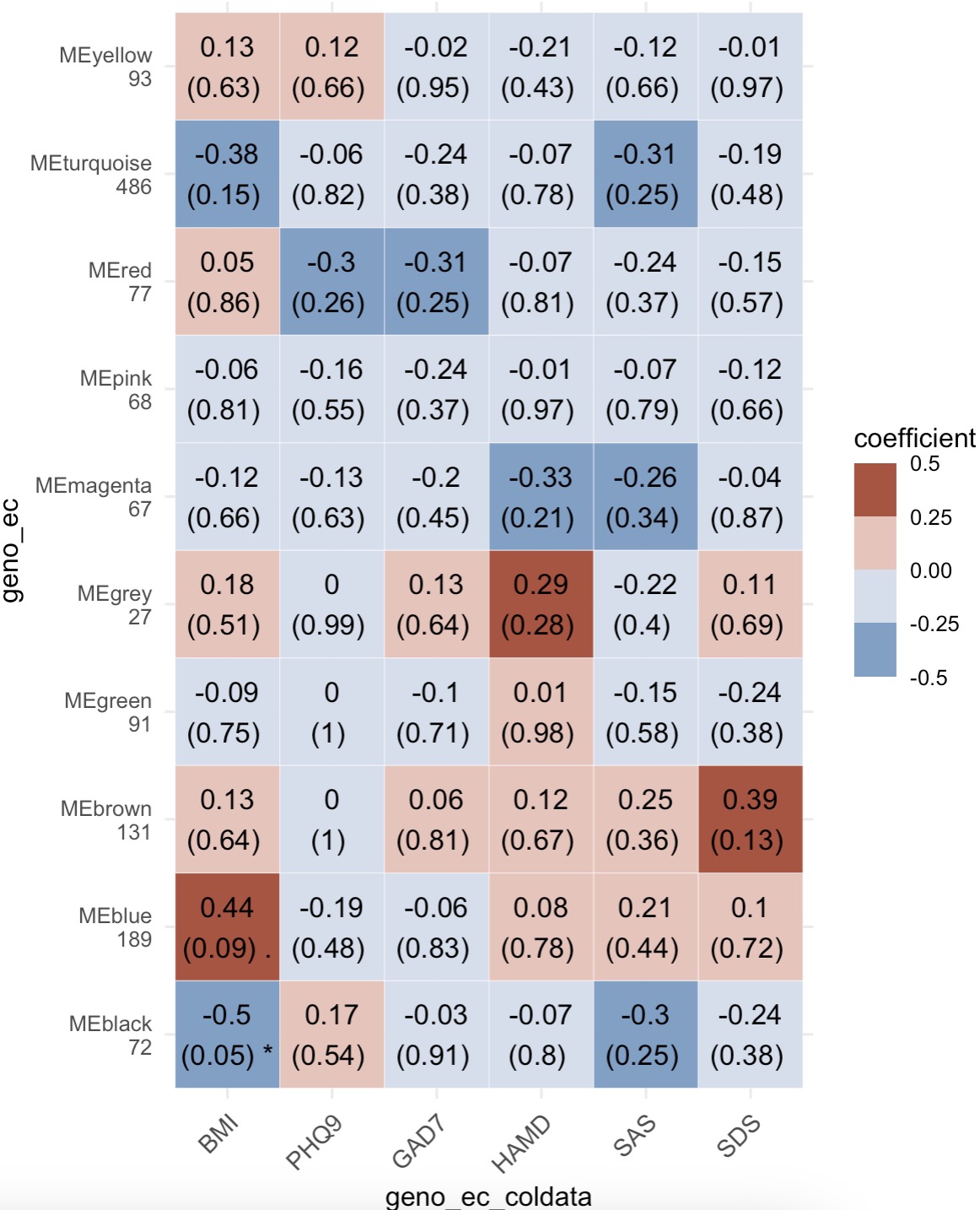
8.3.3 WGCNA相关性热图
模块EMP_heatmap_plot可以直接对接WGCNA相关性分析的结果。详见:6.10 EMP_WGCNA_cor_analysis。
🏷️示例:
MAE |>
  EMP_assay_extract('geno_ec')  |>
  EMP_identify_assay(method = 'edgeR',estimate_group = 'Group') |>
  EMP_WGCNA_cluster_analysis(RsquaredCut = 0.85,mergeCutHeight=0.4)  |>
  EMP_WGCNA_cor_analysis(coldata_to_assay = c('BMI','PHQ9','GAD7','HAMD','SAS','SDS')) |>
  EMP_heatmap_plot()